Damis Daily Deals is a modern retail supermarket brand positioned as a convenient, customer focused one stop shopping destination.
This project focused on developing a bold and approachable brand identity alongside marketing assets that communicate affordability, accessibility, and everyday value.
The goal was to create a visual presence that feels contemporary, trustworthy, and relatable to families and everyday shoppers.
The Challenge
The Problem
The brand needed:
A strong identity in a competitive retail market
A modern visual system that appeals to urban shoppers
Clear positioning as affordable yet quality driven
Branding that communicates convenience and daily value
Marketing visuals that feel vibrant but not overwhelming
Retail brands often struggle with blending affordability messaging with premium perception. The challenge was to create a brand that feels accessible without appearing cheap.
What We Did
Our Solution
1. Clear Brand Positioning
We positioned Damis Daily Deals as:
“A customer friendly retail store offering quality essentials at competitive prices.”
The messaging emphasizes convenience, value, and everyday reliability.
2. Bold Visual Identity
A strong purple background was used to:
Differentiate from typical red based supermarket branding
Create strong brand recall
Communicate vibrancy and confidence
White typography provides high contrast for readability while maintaining a clean, modern feel.
3. Lifestyle Centered Imagery
The use of real life shopping visuals reinforces:
Relatability
Family orientation
Everyday convenience
In store experience
This ensures the brand feels human and community driven rather than corporate and distant.
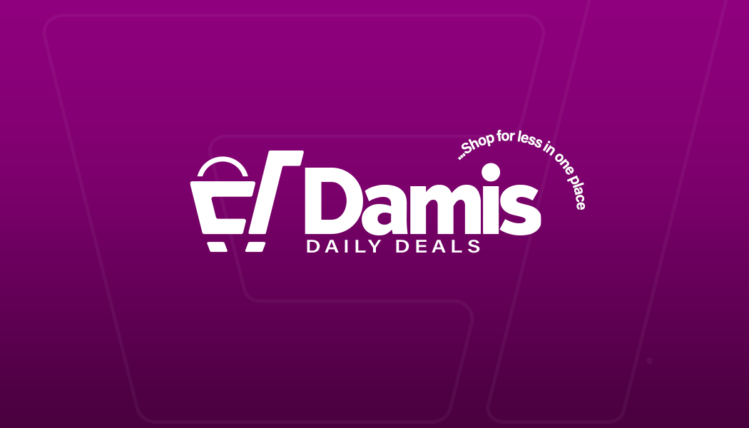
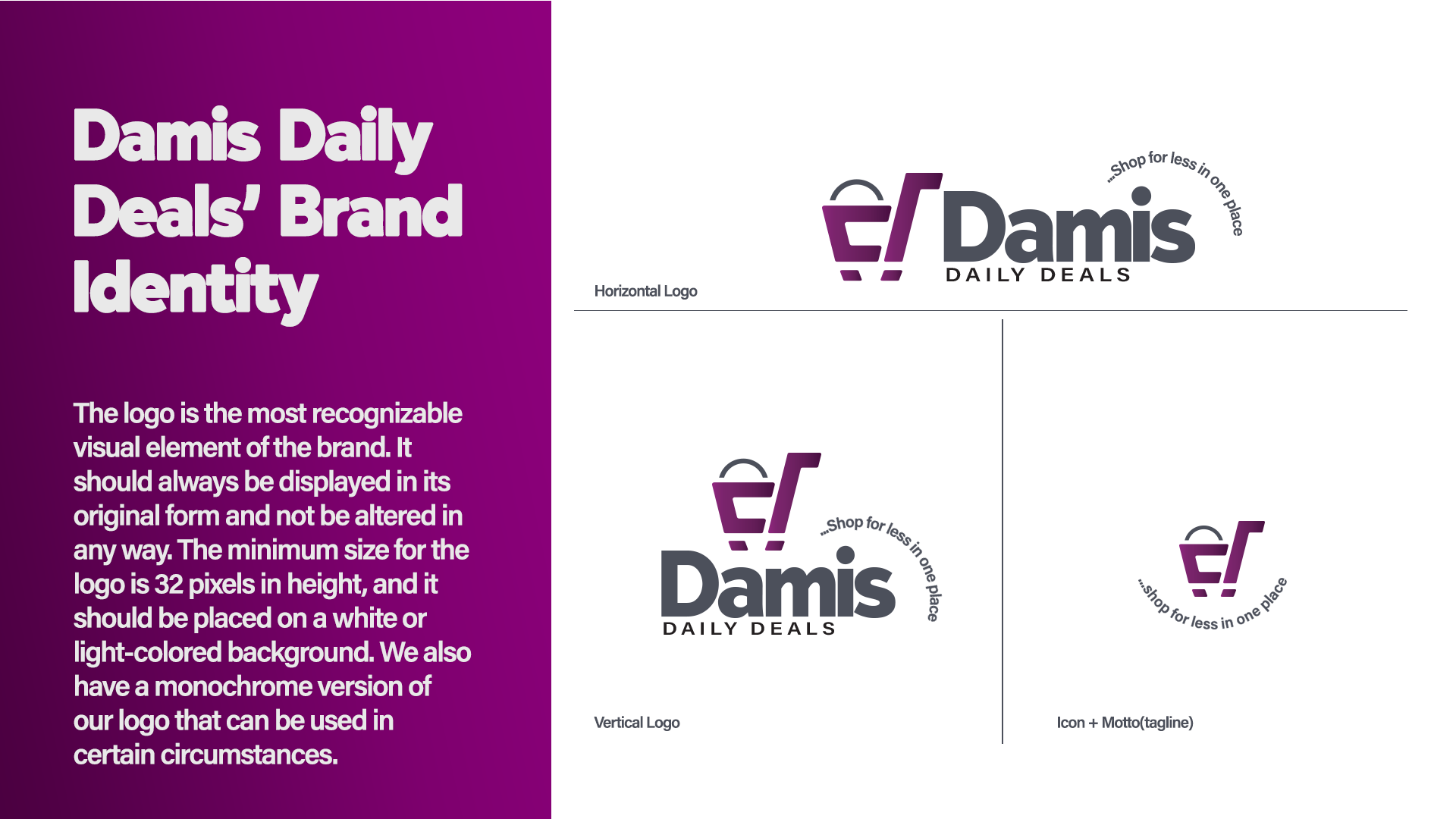
4. Logo Integration & Brand Mark
The shopping cart icon integrated into the logo reinforces:
Retail identity
Simplicity
Immediate recognition
The circular tagline element “Shop for less in one place” strengthens the value proposition visually and verbally.
5. Marketing Clarity
The copy was structured to clearly communicate:
Wide product range
Household essentials availability
Competitive pricing
One stop convenience
The messaging remains direct, easy to understand, and benefit focused.
Outcomes
Results
A bold and memorable retail brand identity
Strong visual differentiation in a crowded market
Clear communication of value and convenience
Marketing assets that appeal to families and daily shoppers
A scalable identity system for in store and digital expansion
The final result is a confident, modern retail brand designed to attract everyday shoppers while building long term customer trust.