Sizzling Spot is a modern food brand positioned around bold flavour, authenticity, and memorable culinary experiences. The project focused on building a cohesive and premium visual identity that reflects warmth, taste, culture, and energy.
From logo development to merchandise, packaging, and outdoor advertising, the goal was to create a brand system that feels consistent across every touchpoint while standing out in a competitive food market.
The Challenge
The Problem
The brand needed:
A distinct identity in a saturated food industry
Visual consistency across multiple brand assets
Packaging that communicates quality and flavour instantly
A bold presence for both physical and outdoor marketing
A design system that feels modern but still culturally relatable
Many food brands struggle with looking generic or inconsistent across materials. Without a strong visual system, it becomes difficult to build trust, recall, and emotional connection with customers.
What We Did
Our Solution
We developed a comprehensive brand identity and design system that includes:
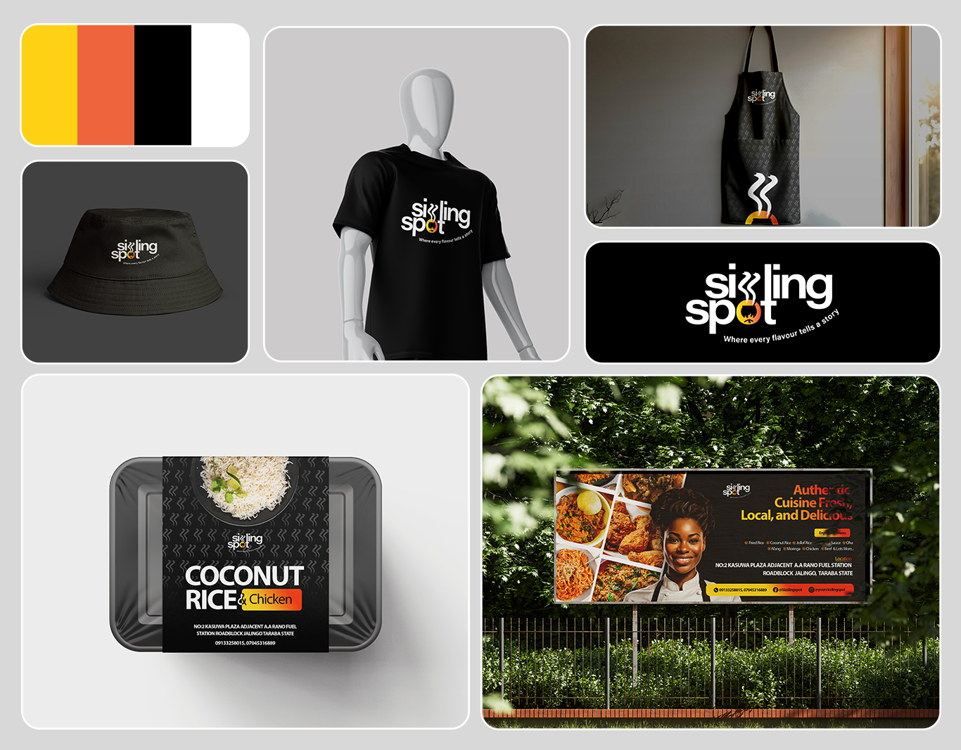
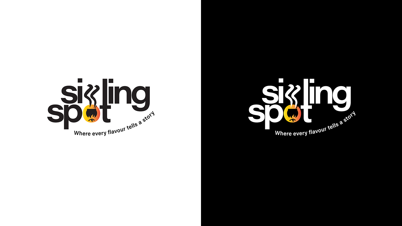
1. Logo & Visual Identity
A clean, modern wordmark with a symbolic heat element integrated into the design, reinforcing the “sizzling” concept visually. The typography is bold, legible, and highly adaptable for print, digital, and merchandise.
2. Strategic Colour Palette
Black for strength and sophistication
Orange to represent heat and appetite
Yellow for warmth and vibrancy
This combination creates strong contrast and instant recognition.
3. Merchandise & Brand Extensions
We extended the brand across:
T-shirts
Bucket hats
Tote bags
This strengthens brand visibility and builds lifestyle appeal beyond just food.
4. Packaging Design
The food packaging was designed to:
Look premium and clean
Highlight menu items clearly
Maintain strong brand presence
Be visually appealing for social media photography
The packaging ensures that even takeaway meals become brand advertisements.
5. Billboard & Outdoor Campaign
A bold outdoor design combining food imagery, warm tones, and confident messaging. The layout ensures:
Clear readability from distance
Emotional appeal through imagery
Immediate appetite stimulation
Strong call to action and location visibility
Outcomes
Results
A cohesive and memorable food brand identity
Strong visual consistency across all brand materials
Premium packaging that elevates perceived value
Increased brand visibility through merchandise
High-impact outdoor marketing presence
A modern brand that feels authentic, bold, and culturally grounded
The final result is not just a logo or packaging system — it is a complete brand experience designed to build trust, attract attention, and increase customer engagement.